Joe Marshall proposes the idea of a “log-gap chart” for visualising time-series data:
Sometimes you want to visualize your time-series data in a chart. Traditionally, this is done by slicing your time-scale into equal-sized bins and counting the events that fall into each one. […] But binning the data destroys resolution.
Instead, Joe suggests plotting each event on a horizontal time axis, with the vertical axis recording the (logarithm of the) time since the previous event. This way, you see heavy bands around the modal interval between events, but outliers and bursts are also clearly visible.
Because we take the logarithm of the gap, the data become insensitive to scale. We can plot small intervals of a single second right next to large intervals of hours on the same axis without losing the shape of either. The steady state appears as a cloud of points high up in the chart, while burst traffic shows as vertical lines.
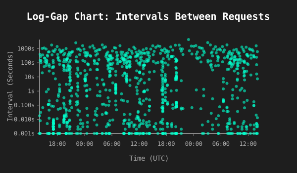
Corollary: logarithms being what they are, if you flip the plot upside down, you get a visualisation of the arrival rate.
 Atom feed for links tagged with visualisation